Sorry for the short post today, somehow I managed to schedule three outings in one day- this morning I had a school visit in Arlington, in a few minutes a college student is interviewing me for her research about kids books, and tonight I'll be signing books at the Wellesley book fair. After weeks of sitting quietly in my studio this is a lot of talking for me. Heres hoping I don't lose my voice!
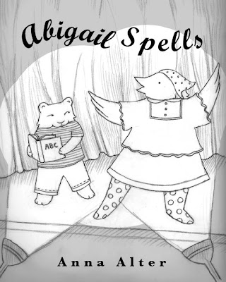
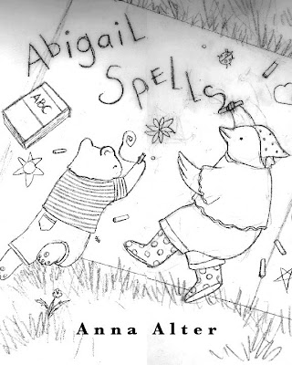
In the meantime, here are some jacket sketches I've been working on for my new book. I think my favorite is the first one, what do you think?


18 comments:
I like the first one best too. You can really "feel" the excitement of being there.
gail
I like the first one best as well, but they are all adorable. Maybe have the title be on a banner in the first cover- like the banners that they hang behind the kids a the National Spelling Bee (and at some local bees). It might make it feel more "contesty" instead of like a play.
Love it though!
Dana
www.readwriteknitpanic.blogspot.com
I don't know, I kind of like the second one the most. I think it may have to do with the action that's going on in the image-- very playful and an intimate look at kids being kids. My favorite part in the third image is the one character holding the can of paint for the other.
No. 3! The chicken is active, purposeful, and engages the viewer. That's all you could ask for in a chicken. Or a cover.
I love the art in all three. It's just really appealing and right up my alley. I do feel like the first one makes it look like Abigail is in a play, and the third like Abigail is an artist (is she?). Therefore, I guess I like the second one best. I think I would prefer the stage setting, but a more spelling-bee-looking pose. 'Course all this is from someone who doesn't know what the story is like at all! :)
I'm voting for the 2nd one! I like that she's actually spelling...
Second one is fabulous!
I pick number 2. I love the nervous exceitment of being on the stage, spotlights and all but number 2 is, I think, more warm and friendly perhaps. It's got so much going on in the scene, I can see it really standing out once coloured.
Anna,
I think the first is the most striking. I think the second would make a great title page.
Thanks everyone, I love hearing all the different points of view! I'll let you know which one we decide on.
I really like the idea of having the title on #1 appear like a spelling bee banner, great idea! I'll mention it to the designer.
ps. Elaine- The title page has a picture similar to #2, with Abigail writing on a chalk board. You read my mind!
I love #2! It's such a cozy image, and different, too, which makes it interesting. But all are great.
Hi Anna,
If the title page has Abigail writing, I wouldn't duplicate that on the cover-definitely have her up on stage in the midst of a spelling bee...maybe have it look like she is spelling out Abigail Spells, just not with a writing or painting implement. Can you put the title in a speech bubble and make it look like she's actually spelling it out? Just a thought.....
Anyway, the art is as charming as always!
First, I think they're all great... but my pick is #2. It's very different from anything I've seen lately--the composition is dynamic. It also really says spelling to me, while the others could be school plays, etc. Go with #2!
This is just my opinion, of course.
Another thought: I think #1 matches the book's theme of a child spelling words orally in a bee--and not physically writing words.
I don't know. Anyone looking at number 1 and not reading the title (maybe even reading the title) will think it's a school play - the bird is very theatrical, there are big spot lights, etc.
I love #2, but I think #1 will be more eyecatching on store shelves. I think the common mantra is simpler is better for a book cover--less elements, strong color scheme, target focus. Not that you can't break the rules, of course!
#1 grabbed me with great energy.
#2 seems passive, to me.
topangamaria
Post a Comment